
Giving floor teams a live quality score
Why real-time feedback beats end-of-shift reports — and what changed when operators saw their pass rate live.
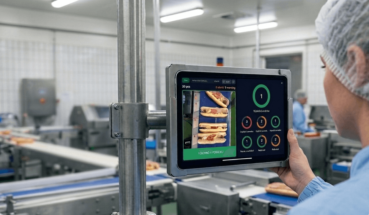
Quality reports have a timing problem. By the time a shift report says line 2 ran at 94% pass rate, the shift is over, the crew is home, and nobody remembers what was different about hour three. The data is accurate and useless.
So when we designed the floor display, we made one decision early: the primary audience is the operator standing at the line right now — not the manager reading a dashboard tomorrow.
What the display shows
Today's piece count, live pass rate, the top three defects of the last hour, and takt against target. Big numbers, readable from five metres, green when the batch is in spec. When something drifts, the defect thumbnails show what the camera is seeing — a missing topping, a crooked lid — not an error code.
"Nobody waits for the end-of-shift report anymore. If the score dips, someone walks over and fixes the cause within minutes." — Head of Quality, Crocodille
What changed on the floor
The surprise wasn't fewer defects — it was who caught them. Operators started treating the pass rate like a game score, spotting drift before the quality team did. Shift handovers got shorter: the incoming crew sees the day's curve, not a verbal summary. And the recurring argument about "whose shift produced the bad batch" simply ended, because the answer is on the screen.
Managers still get their analytics portal — trends, downtime, batch comparisons. But the biggest quality gains came from the cheapest screen in the plant: the one the line crew actually looks at.